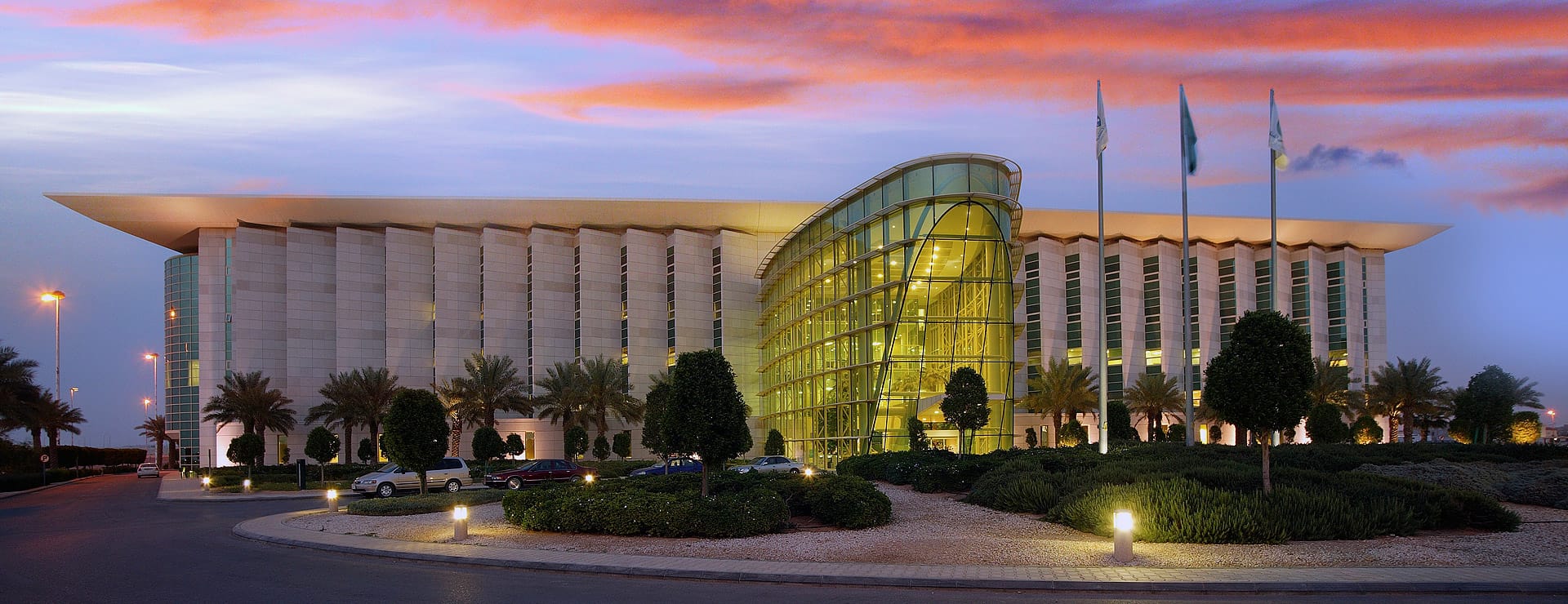
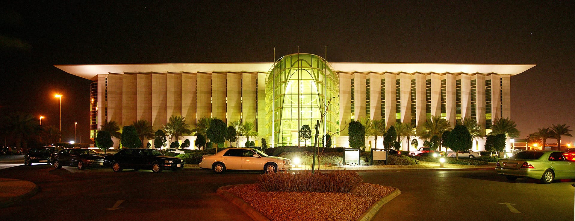
Where functionality and design go hand-in-hand, the Kingdom Hospital has become a “Centre of Excellence” for private diagnosis and medical care in Saudi Arabia. Its unique architecture seamlessly ties in elements of appearance, ambiance and effectiveness of internal functional relationships.
Omrania worked in a joint venture partnership with HLW of New York, USA (architects, medical planners and engineers) to design this ‘State of the Art’ hospital based upon the Mayo Clinic model.
The complex occupies a 41,000m² site in the north of Riyadh, and consists of a renovated existing 3-storey building and a new 5-storey building. The existing and new buildings comes together at this hospital so that visitors do not notice a stark change in design, only a uniform and flowing expansion that unifies functionality and operations. The existing 3-storey building (17,000 m2 B.U.A) has been renovated to provide administration offices, housekeeping, staff recreation, hospital physiotherapy and staff canteen on the ground floor with the first and second floor levels being staff accommodation. While the new 5-storey building (21,000 m2 B.U.A) contains a fully functional private hospital of 120 beds which serves as an integrated diagnostic Centre with Consulting Suites.
Patient flow through the Consulting Suites operates on the Mayo Clinic model which provides direct access to Specialists or through the Primary Care Clinicians. The suites are backed up by the latest ‘state of the art’ diagnostic technology in imaging, clinical measurement and pathology. The Hospital has centralised state of the art laboratories for Biochemistry and Hematologry, Microbiology, Serology, Mycology, Cytology and Histology.

Kingdom Hospital – Site Plan © Omrania
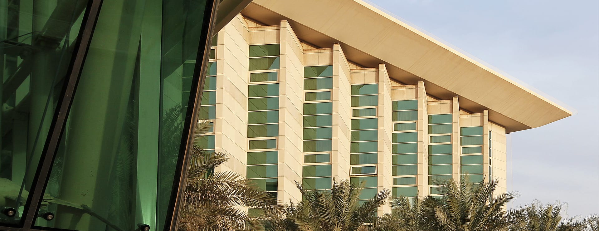
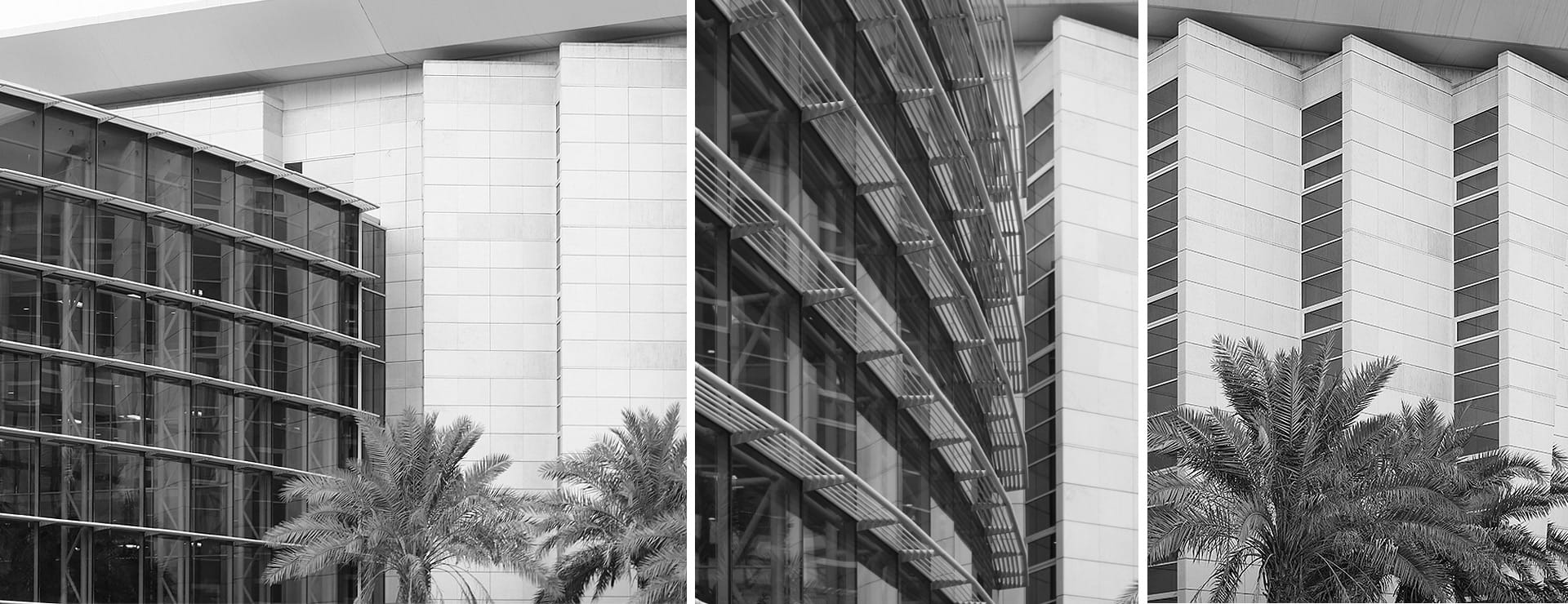
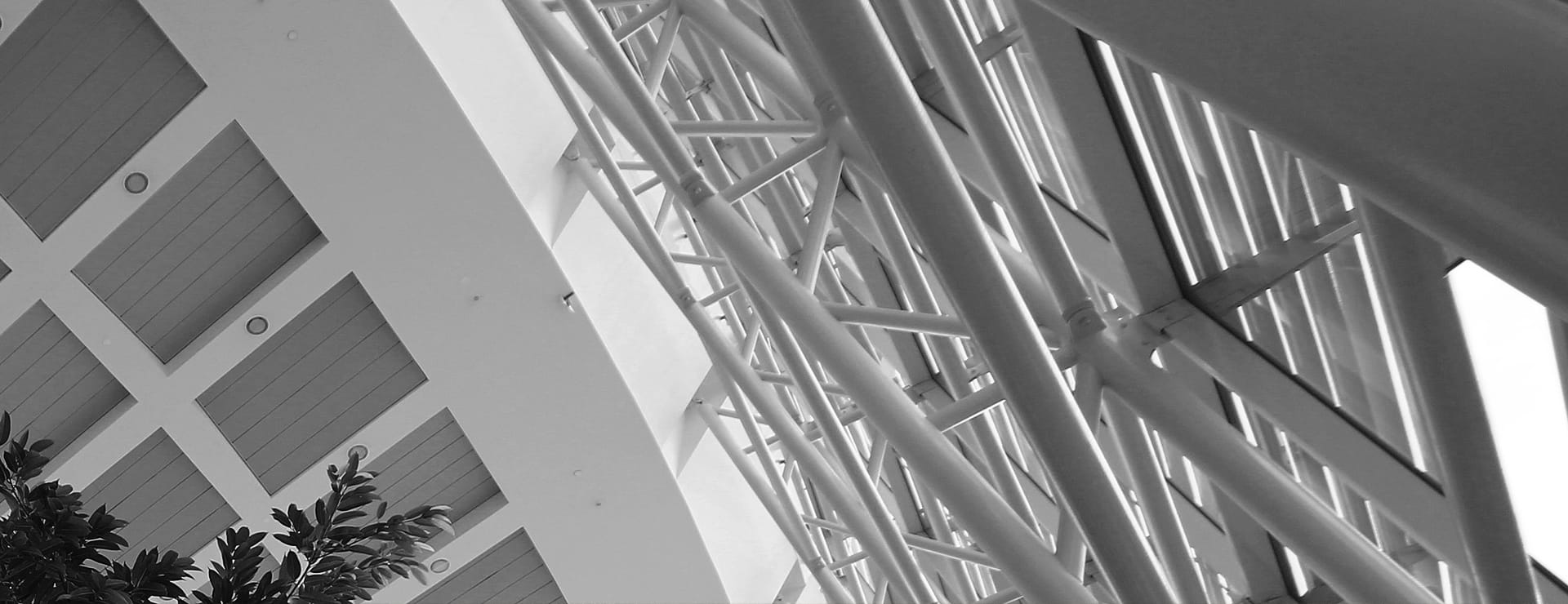
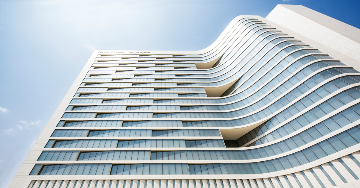
On the exterior, an exceptional glass atrium/entrance takes center stage. The prominent main entrance is a four storey glazed – and heavily landscaped – atrium which reinforces the grandeur and event of arrival. The main building behind it is clad by the beautiful Riyadh stone. Stone is bush hammered and polished in a configuration which creates horizontal bands on the elevation, which compliment the verticality of a “saw tooth” plan formation. Lush landscaping completes the design. The modern design flows from the exterior to the interiors, to make this more than just a hospital.
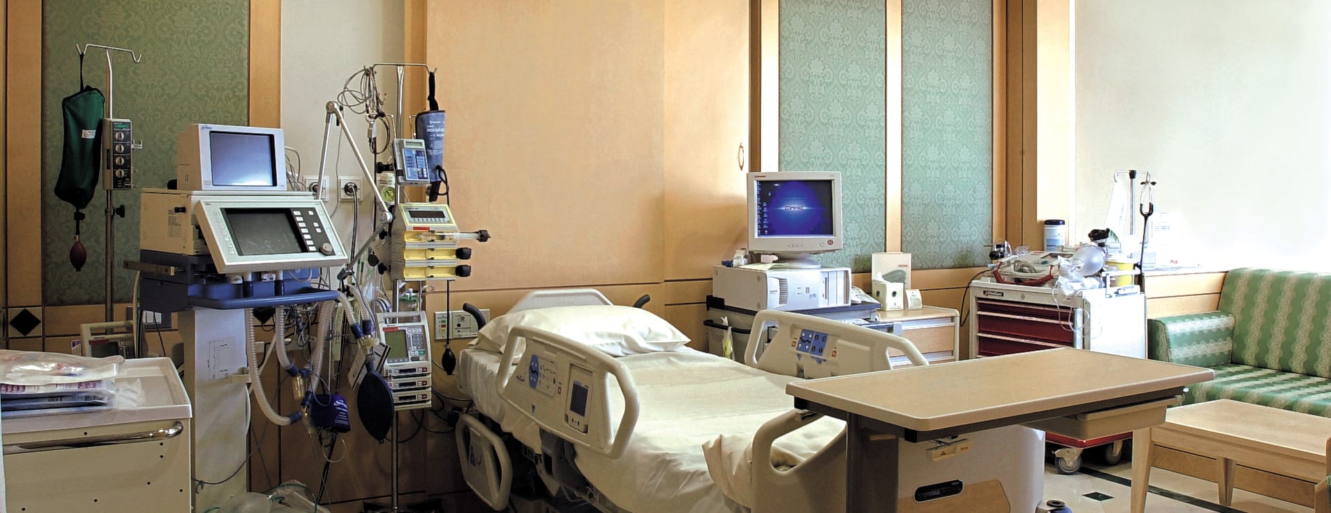
The interior is finished with comfortable lounging chairs, marble accents, and soft color schemes. With careful consideration to the use of glass walls, the hospital also keeps a warm and inviting environment by its balance between natural and artificial light. Patient rooms are warm and comfortable, utilizing elements like wood wall panels, marble floors, large windows, and sleek finishes to make a patient’s stay more like a retreat than a recovery period.
