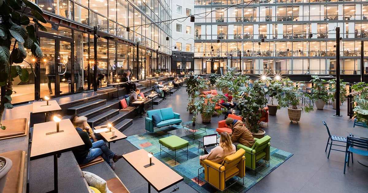
 Epicenter Co-working Office Space, Stockholm, Sweden.
 .
Attracting and retaining innovative talent is a major consideration for employers today, adding to long-standing challenges for office designers. Increasingly, concerns of maximizing square footage and productivity are augmented by considerations of employee wellness and promoting flexibility and creative collaboration. Technology giants like Google have gone all in on the workplace-as-playground, but some employee-centric design concepts stem from well before the digital era.
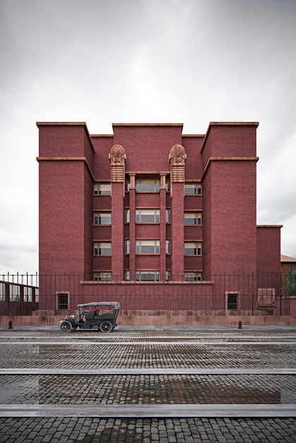
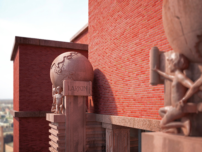
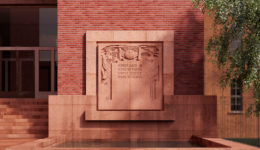
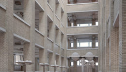
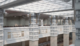
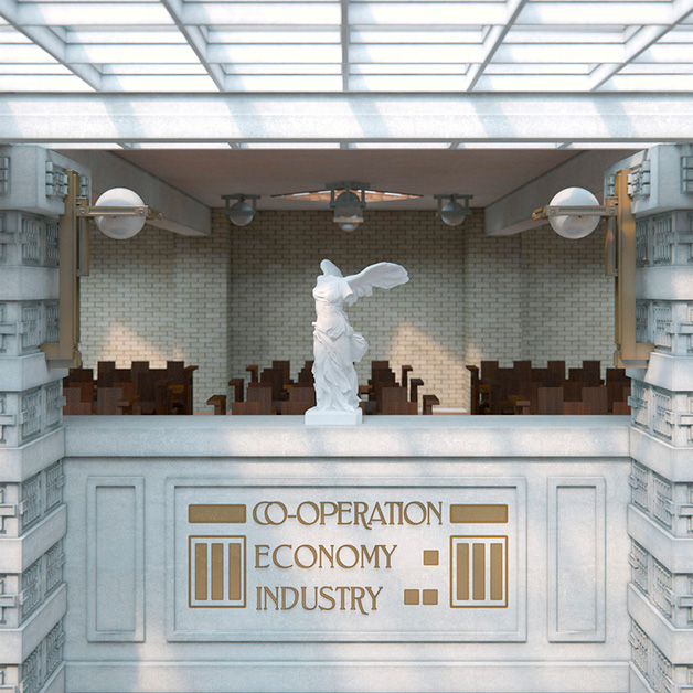
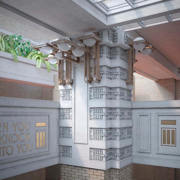
Over a century ago, Frank Lloyd Wright’s Larkin Administration building in Buffalo (1903) incorporated a number of progressive design features. The central, sky-lit light court with perimeter balconies brought natural light to workers anywhere in the building, while an early air conditioning system provided a comfortable retreat from the industrial conditions of the site. Wright’s plan incorporated a restaurant, continuing education classroom, library, and even a pipe organ to make workers feel like part of the Larkin “family.” Like most offices today, the Larkin building also had an open floor plan. Even the few private offices for company executives were connected to the common space through clerestory openings. While these open workspaces contributed to a sense of communal cooperation, there was a near-total lack of sound containment and visual privacy.
3D visualizations of the Larkin Administration Building, Buffalo, USA. Photos © David Romero
The challenge to provide privacy and define individual spaces within an otherwise open plan gave rise to an infamous solution in the late 20th century: the cubicle. The story of Robert Propst’s supposed invention of the cubicle has been widely told. It’s crucial to note, however, that his Action Office I system (1964) was intended to combat the sort of rigid compartmentalization of workers as seen in midcentury office environments like SOM’s Union Carbide building. It featured function-based units that promoted frequent movement and adjustable-height and sit-to-stand desks — not such a new trend in office wellness after all. Propst’s revision of the system, Action Office II (1968), added dividers with obtuse angles so partitioning would be dynamic rather than boxy. But competitors took his basic concept and made it cheaper and more rectilinear, and the age of the cubicle began.
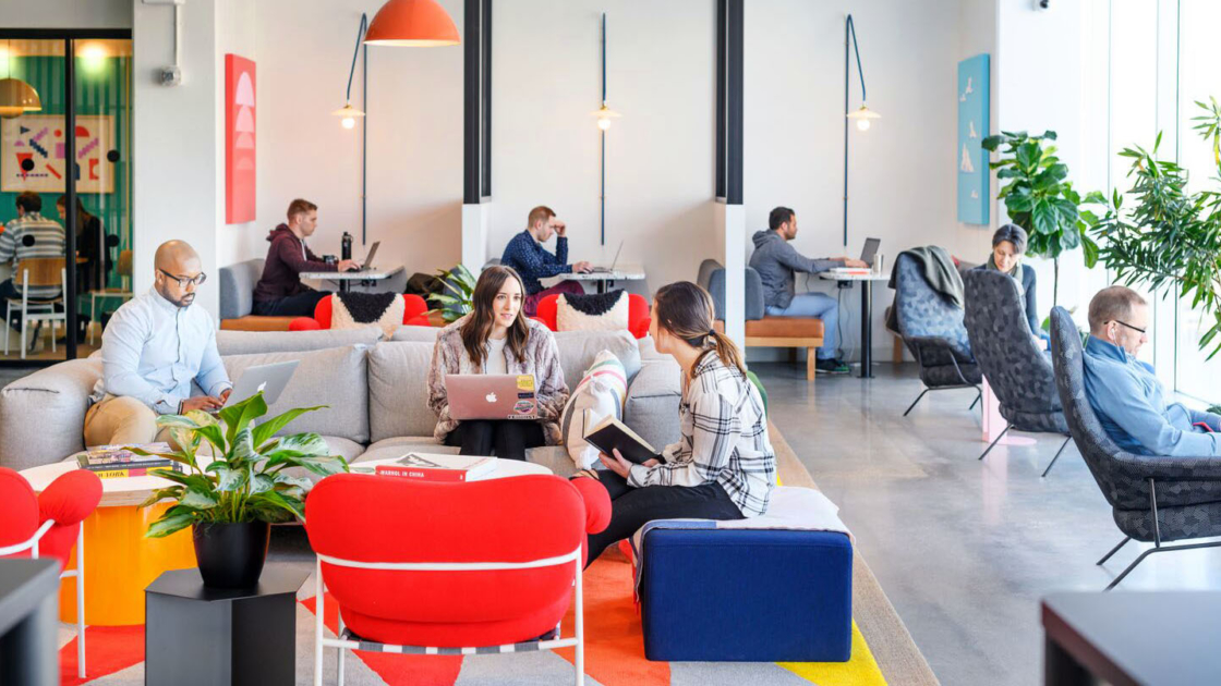
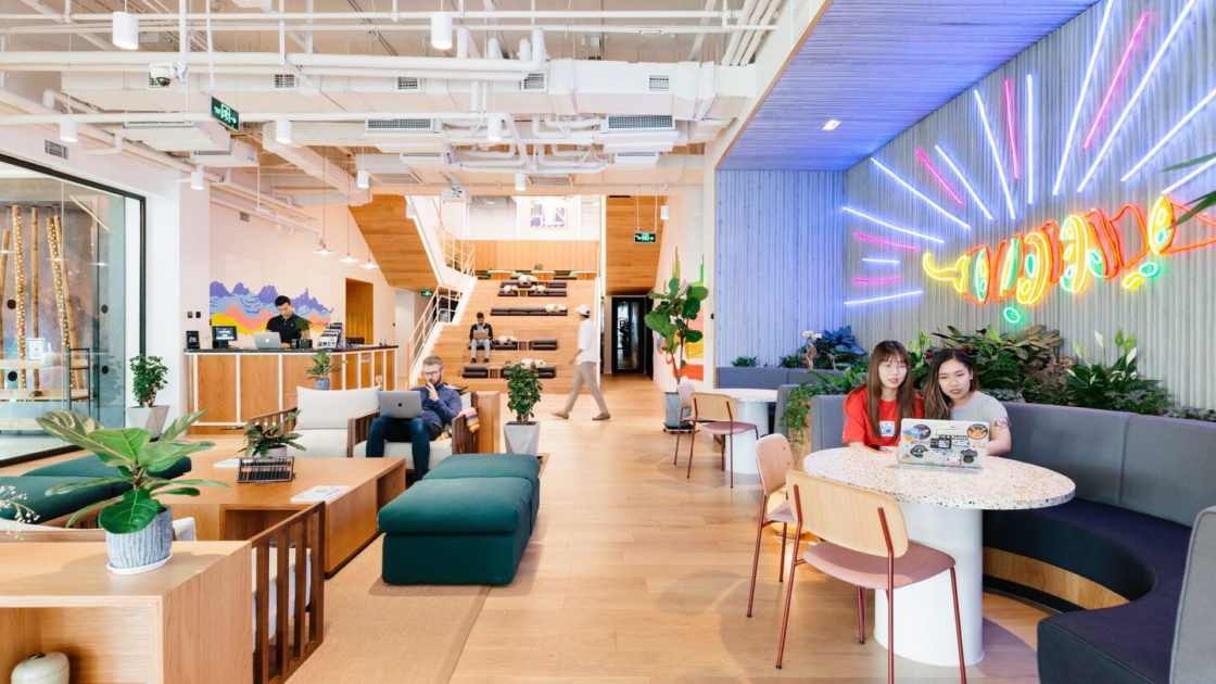
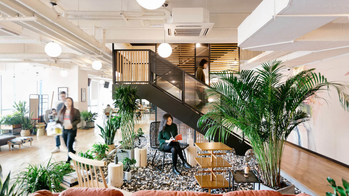
Thankfully, cubicles have been dismantled in many offices in the last few decades. A design dead-end has been reversed, but along with it, challenges of sound and visual privacy have been reintroduced. At the same time, remote work has added expectations that offices have more of the comforts of home. Remote work and the “gig economy” of highly mobile workers have turned the office into more of a temporary gathering place than a permanent base. This has fueled the rise of co-working options like WeWork, where individuals and entire teams can rent a wide variety of workspaces tailored to their needs. Ubiquitous WiFi has brought even more freedom of movement for workers, untethering them from any one assigned workstation—a trend known as “hot desking.”
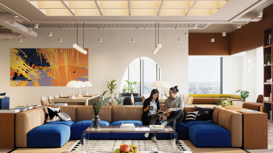
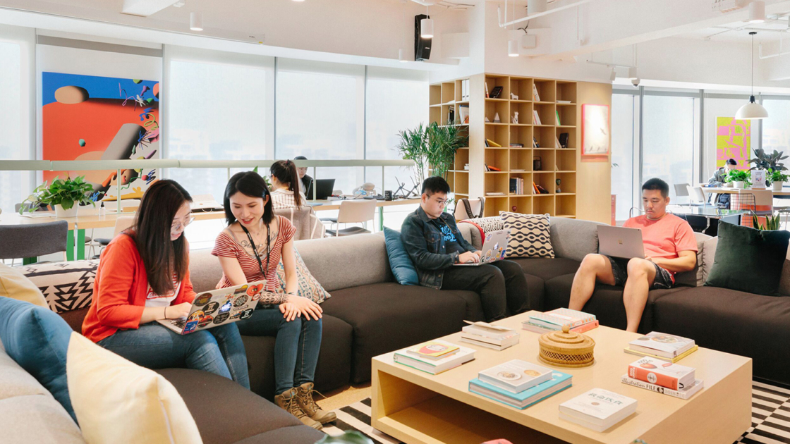
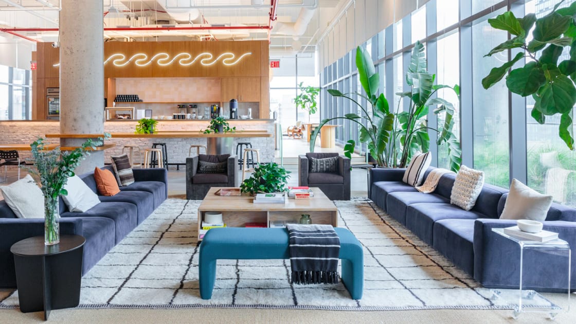
Various office and co-working spaces offered by WeWork around the world. Photos © WeWork
So in at least some office environments today, dedicated desks and individually partitioned spaces appear obsolete. Yet there are signs that the trend may have spread too far, too fast, as office workers grapple with the lack of privacy that comes with total openness.
For designers then, the best approach to a blank slate of office space may be to balance open spaces for collaborative work with closed conference rooms and retreats for more introverted pursuits. Throughout, it may be useful to look to the trials and errors of office design history to find solutions that have stood the test of time.
Omrania, a renowned architecture firm, has established a reputation for excellence in blending aesthetic and functional design, setting a benchmark for architecture firms in Riyadh, Saudi Arabia.


